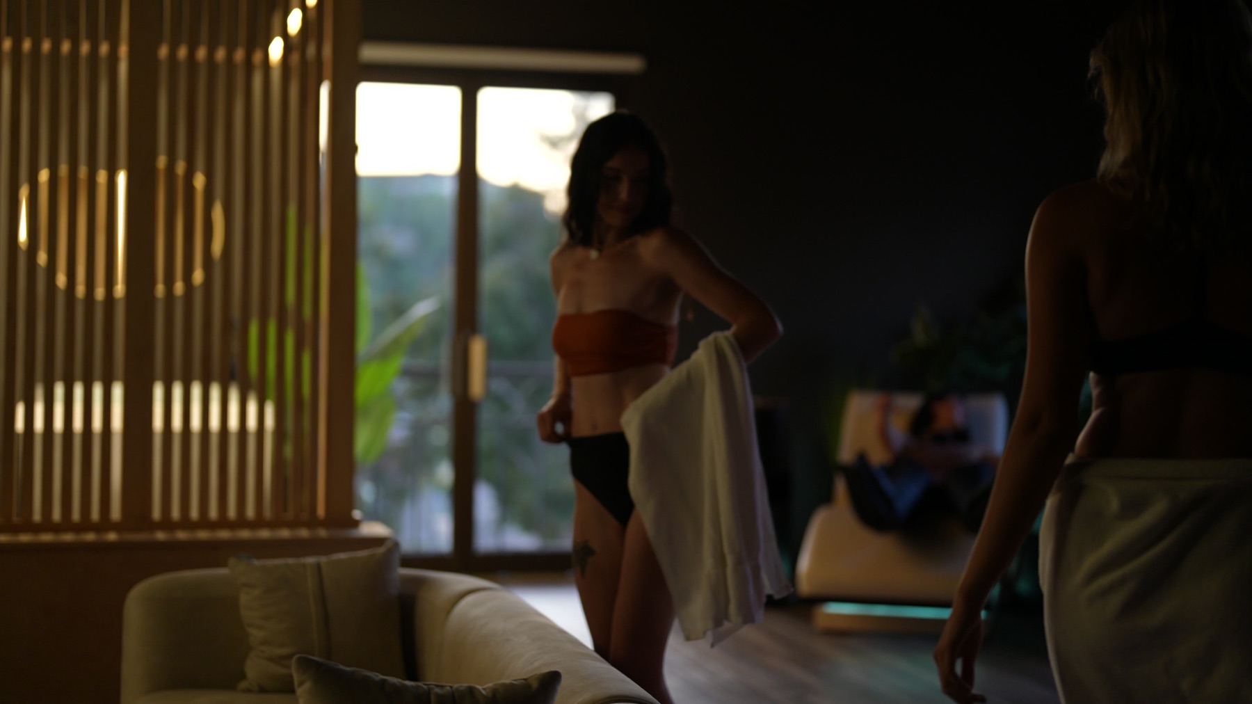
The Studio — Full Site
A real multi-page website: a clean homepage that shows everything you do at a glance, with a dedicated page for each pillar — Classes, Training & Testing, Recovery, Bodywork, Events. Built in your actual Studio brand (warm black + sand, your serif logo), with premium imagery and a sample athlete report. Start here.
Enter the site →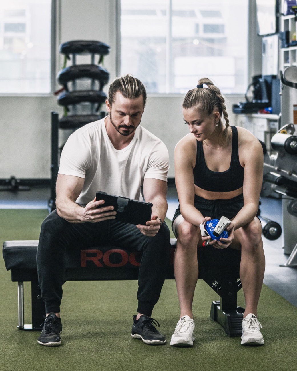
Sanctuary
Warm neutrals and elegant serif type. Science-led but inviting — reads like a high-end longevity practice. "Serious about your health, never intimidating."
View Direction A →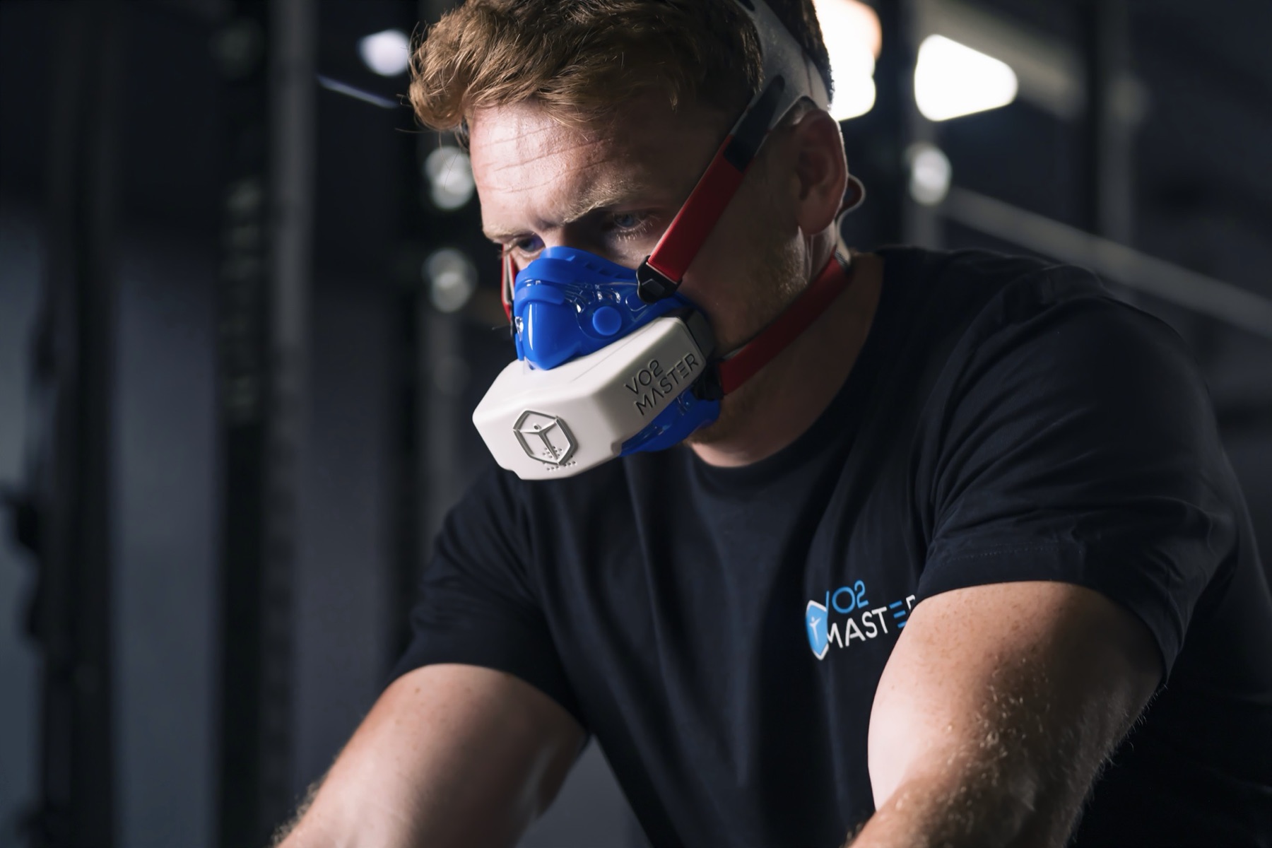
Protocol
Near-black, electric cyan, big athletic type and data. Reads like a high-performance lab — "stop guessing, start measuring." The strongest fit for the science-driven story.
View Direction B →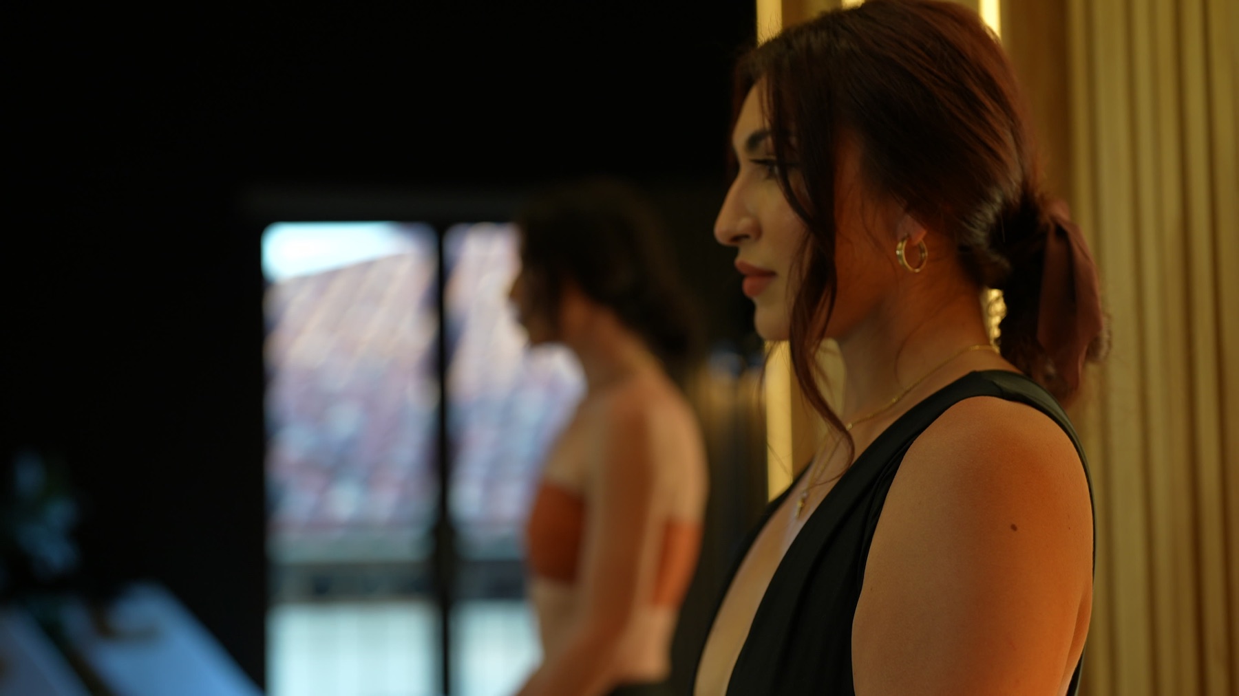
Editorial
Oversized type, ruled lines, warm paper with an ember accent. "Health, on the record" — reads like a beautifully art-directed magazine. Science with editorial polish.
View Direction C →